More and more people are using mobile devices, not just to contact friends and relatives, as well as to perform tasks that were previously done using a desktop.
For example, a few years ago, we had to read our emails on our computers, but now, we can read them using our smartphones instantaneously, which means that most of the People can communicate quickly and efficiently. It is difficult to estimate precisely how many people open their e-mails through their smartphone, but we know that this number is increasing day by day.
This is a change in the profile of the users that should be taken into consideration when planning your email marketing campaigns. If you want your campaign to be effective, the only solution is to adapt its layout, so that all users can read the email, no matter the device they’re using to open the message.
Here are some tips for optimizing the design of your emails for mobile devices.
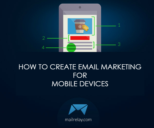
1. Increase fonts: To tailor your message to smartphones, you should use larger fonts than those used in messages that will be opened on larger screens. iOS specifies a minimum of 13px for the fonts, so you should adjust them to this size if you are using smaller fonts. It is therefore recommended a minimum size of 14px, with headers larger than 22px.
2. Look at the margins: iOS adjusts the zoom of emails to adapt them to the width of the screen, but the other systems won’t do it, so if your newsletter doesn’t have adequate margins, the user will need to move the text from left to right to be able to read your message, which makes it uncomfortable and can make your campaign less efficient, because many users will stop reading the email.
To prevent this from occurring, try to use a width between 220-550px in your emails.
In Mailrelay, we offer templates with an appropriate design, such as our Christmas template. You can find many other templates on your Mailrelay account, clicking on Templates -> Predefined templates.
3. Call to action: The most crucial and useful part of any email design is the call to action, (these buttons with phrases like “Buy now” or “Apply now”). This button should be inserted in the center of the screen. Don’t be afraid to add a very large button, (you could create a 44x44px button.)
4. Simplify. Do your best to simplify the email, without using advanced headers, as well as only relevant navigation bars, tools to share on social networks or too many CTAs, so that it is possible to keep a clear and clean design.
5. Images: The only OS that doesn’t block the images is iOS. The other OS will alert the user about the existence of images, but it is the subscriber that will have to manually click to display images. Use only relevant images to illustrate the product or service you’re offering.
6. Shorten links when possible: Review your email and shorten links, taking images or texts that may be considered irrelevant, to create a cleaner, but not unattractive email.
7. Layout: While the design of newsletters usually has two or three columns, in the case of emails directed to mobile devices, it is recommended to use a single column, which can be easily adapted to all types of screen, so that your message is readable.
8. Highlight: Make your email as visible as possible. Even if CTAs are usually created using different colors or images, you can further enhance your newsletter, adding eye-catching shadows or colors. Try using colors and other resources in the fonts that guide the reader through the information.
9. Adapt the text for touchscreens: Leave spaces between lines and add larger buttons that will facilitate the navigation, which will improve the interaction with the newsletter.
And now that you know what the requirements are for creating email targeted for reading on mobile phones, here are some websites which you can use to find templates so you can create more efficient emails:
In this website, you will find a series of 5 templates that you can use on your email campaigns, with spaces for an unsubscribe link, as well as icons for sharing the email on social networks. These templates are offered separately in a style sheet CSS and HTML. To add images, you will need to create and compact a folder with the CSS stylesheet before importing it.
Antwort (free)
Antwort uses HTML with universal compatibility, including Outlook to adapt to the width of each email provider. Their designs have been tested in real environments and real data to prove their reliability. It also offers a style guide and list of frequently asked questions on their website. This is a template that you can easily import into your Mailrelay account.
Market ($ 18)
This template builder offers eight module-based pre-defined designs, including 24 color variations and 28 elements for you to build your custom layout.
The template can be created in three simple steps, so you can prepare the template for your campaigns sent through Mailrelay. Also, the designs are compatible with most email clients, including Outlook.
Campaigner ($ 18)
It offers a package of templates with nine designs, with eight colors and two textures, with more than 120 variations that you could adapt to any newsletter. All these templates were tested on several email clients. Also, you won’t have problems when importing these templates to your Mailrelay account.
You can also find a video tutorial and a PSD file for editing the templates.
Quinn ($ 18)
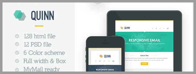
Quinn allows customization of 14 modules for creating unique templates adapted to different strategies using its two designs.
It offers six color combinations as well as a flexible HTML code, with a plug-in compatible with WordPress.
Freelancer ($ 18)
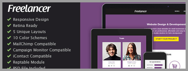
Simple yet beautiful, the Freelancer template is adapted to most newsletters. With five unique designs, different color schemes and tem modules that you could use for your email campaigns, this is a fantastic option for creating efficient newsletters. It also has a CSS template and a flexible code structure.
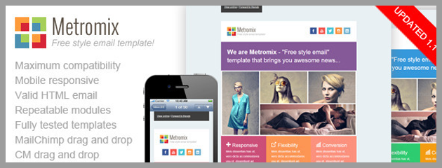
Metromix is an email template for multiple utilities (companies, marketing professionals, ETC) But with a perfect fit for mobile platforms.
It includes seven pre-defined color schemes and mixed designs that you could use for several situations. By adding or deleting blocks, you could easily customize your design.
FancyMail ($ 18)
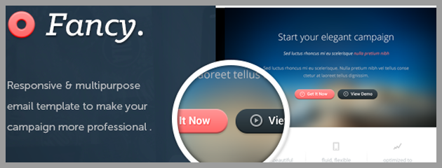
With a professional layout, FancyMail offers you seven designs, eight colors and three design options. Each design fits in different types of screen, including smartphones.
FreshMail ($ 17)
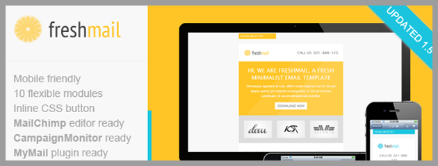
Light and simple. That is how we could define the FreshMail template design, with an easy-to-use platform for creating and customizing the templates.
It is compatible with the major ISPs and has seven designs, pre-defined colors, help documentation, and CSS buttons.
You can import all these templates to your account, adding them to the list of available options when creating your newsletters.
Some of these templates are not free, but as they have a low cost, you will be able to send professionally designed newsletters to all your subscribers with Mailrelay.